Shell Gas
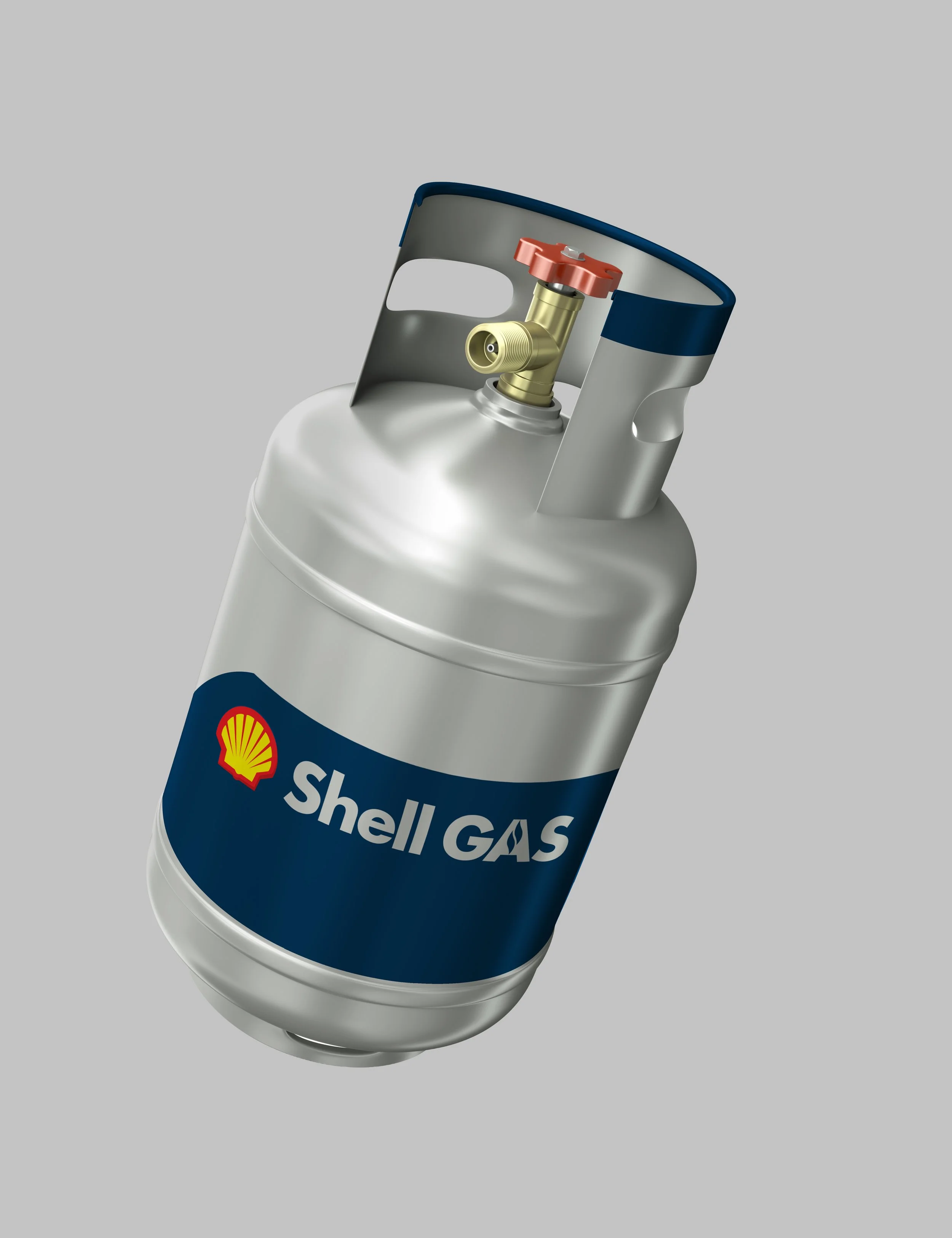
Shell Gas required a distinct visual identity to represent its presence across the European LPG market — one capable of working at the scale of a cylinder label and depot signage and the precision of a corporate document, while holding its own within a global energy brand. Consistency across every touchpoint was critical, from head office through to the smallest distribution point.
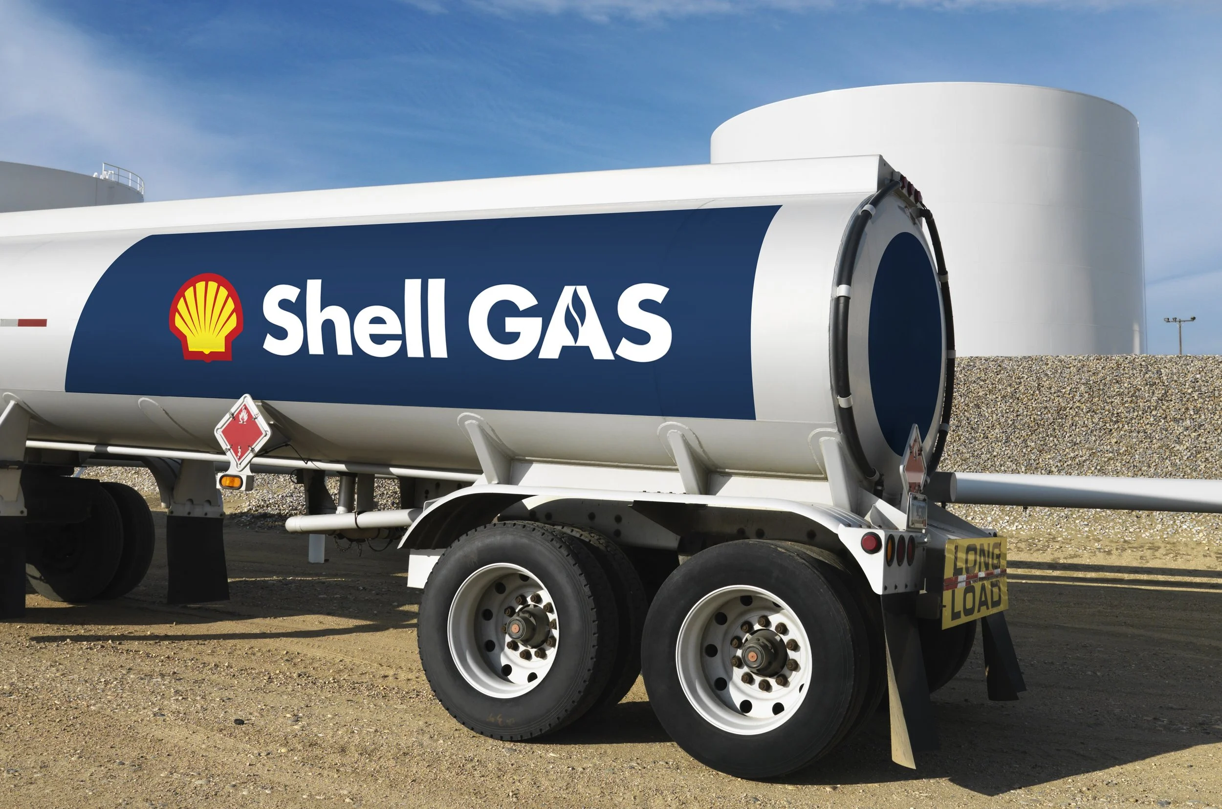
I designed the brandmark and directed the art direction behind it, then developed the brand guidelines that governed its use, ensuring the identity translated cleanly across cylinder branding, signage, and vehicle livery throughout the network. The result is a system built for scale — instantly recognisable, rigorously consistent, and engineered to hold up across hundreds of applications and markets.
-
Energy
-
Shell
-
United Kingdom
-
Brandmark Design
Brand Guidelines
Signage
Livery